Overview of Tableau Software
Introduction to Tableau
Tableau is a powerful data visualization software that empowers users to convert raw data into intuitive and interactive dashboards. This famous tool simplifies data analysis and encourages decision-making through its user-friendly interface. Whether you are a data analyst, a business user, or a data scientist, Tableau offers something for everyone. Imagine quickly visualizing complex datasets in a matter of minutes; that’s the magic of Tableau.
History and Evolution of Tableau
Founded in 2003, Tableau has rapidly evolved to become a leader in data visualization software. Initially created by three Stanford graduates, the motivation was to make data accessible and easy to understand for all. Over the years, Tableau has introduced various enhancements, from its desktop application to cloud solutions and mobile capabilities.
- Key Milestones:
- 2004: Launch of Tableau Desktop.
- 2013: Tableau went public.
- 2020: Acquisition by Salesforce enhances its capabilities.
Key Features and Capabilities of Tableau
Tableau is rich in features that cater to varying business needs. Some key capabilities include:
- Drag-and-Drop Interface: Enables users to create visualizations with ease.
- Real-time Data Analysis: Connects to live data sources, allowing instant insights.
- Robust Sharing Options: Dashboards can be shared securely across platforms.
- Advanced Analytics: Users can perform complex calculations and forecasts.
In a world where data drives decisions, Tableau stands out as a vital tool for organizations striving to harness the power of data effectively.

Getting Started with Tableau
Downloading and Installing Tableau
To embark on your Tableau journey, the first step is to download the software. Tableau offers a free 14-day trial for users to explore its features without commitment. Simply visit the Tableau website, select the version suitable for your operating system, and follow the installation prompts.
- Step-by-Step:
- Go to the Tableau website.
- Click on “Try Now” for the free trial.
- Fill in the required details.
- Download and run the installer.
Once installation is complete, you’re ready to dive in!
Understanding Tableau Interface
Opening Tableau for the first time can feel overwhelming, but familiarizing yourself with its intuitive interface is a breeze. The main components you will engage with include:
- The Data Pane: Where all your connected data sources reside.
- The Sheet Area: The canvas for creating your visualizations.
- The Toolbar: Contains essential tools like save, undo, and formatting options.
With these elements, users can quickly navigate through tasks and start crafting visual stories from their data.
Connecting Data Sources to Tableau
After getting acquainted with the interface, the next exciting step is connecting your data. Tableau supports various data sources, including Excel files, SQL databases, and cloud-based platforms.
- Steps to Connect:
- Open Tableau and select “Connect.”
- Choose your data source type.
- Follow the prompts to locate and select your data file or server.
Once connected, you’re ready to unleash the power of your data. It’s fascinating to see how quickly you can transform numbers into meaningful insights with just a few clicks!
Data Visualization in Tableau
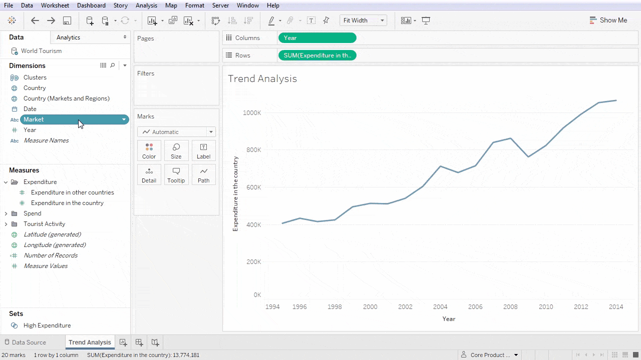
Creating Basic Visualizations
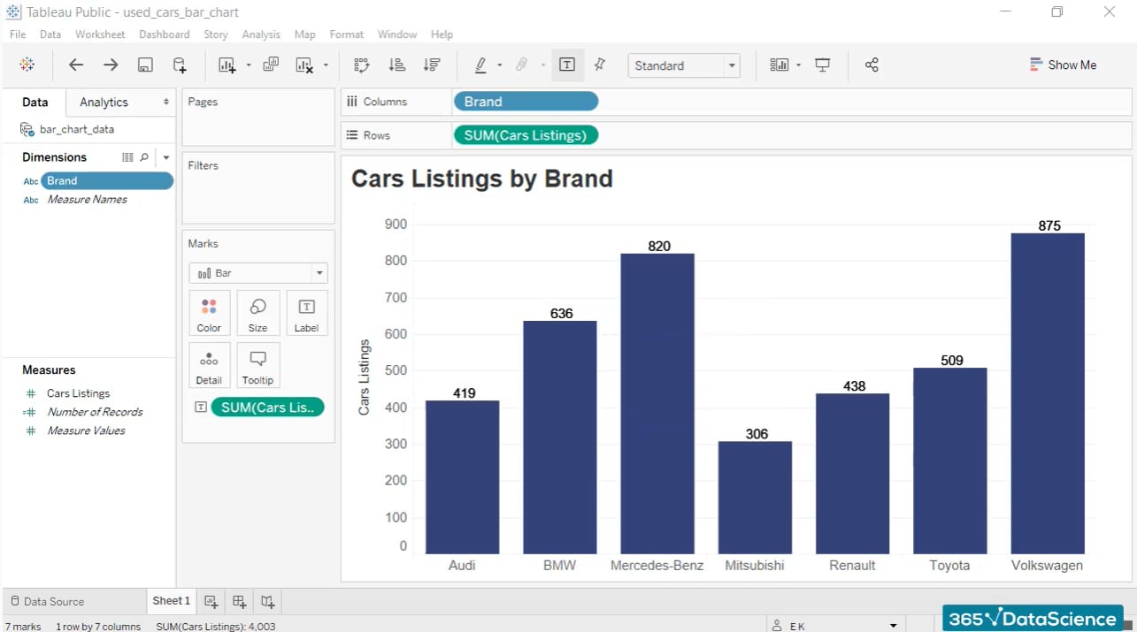
With your data sources connected, it’s time to create basic visualizations in Tableau. The user-friendly drag-and-drop feature allows users to quickly create charts, graphs, and maps. Start by dragging dimensions (categorical data) and measures (quantitative data) into the Rows and Columns shelves.
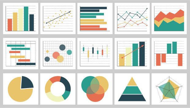
- Types of Basic Visualizations:
- Bar Charts: Great for comparing categories.
- Line Graphs: Perfect for showing trends over time.
- Pie Charts: Use for parts of a whole.
Each choice serves a unique purpose, allowing users to present their data more effectively.
Customizing Visualizations
Once basic visualizations are created, customization is key to enhancing their impact. Tableau allows users to adjust colors, labels, and tooltips to make your visual story engaging.
- Customization Tips:
- Use consistent color schemes to maintain clarity.
- Label your axes appropriately to inform viewers.
- Add clever tooltips for additional context on data points.
Personalizing your visuals can captivate your audience and keep them engaged.
Using Filters, Parameters, and Calculations
To make your data insights more dynamic, using filters, parameters, and calculations is crucial. Filters help to focus on specific data segments, while parameters facilitate interactive visual experiences.
- Common Uses:
- Filters: Restrict data based on selected criteria.
- Parameters: Allow users to switch between scenarios (like sales projections).
- Calculations: Perform custom calculations to derive new insights.
Using these tools enables users to delve deeper into their data, tailoring visualizations to particular needs and facilitating richer analysis. It’s incredible how these features can add depth to simple visuals, transforming them into interactive powerhouses of information.
Advanced Features in Tableau
Mapping with Tableau
Tableau’s mapping capabilities open up a world of possibilities for visualizing geographic data. By simply dragging geographic fields, such as country or state names, onto your visualization, you can create stunning maps that highlight data patterns across regions.
- Key Mapping Features:
- Automatic Geographic Recognition: Tableau automatically recognizes geographic data types.
- Custom Geocoding: Users can add their own location data if needed.
- Heat Maps: Great for visualizing concentrations of data in specific areas.
These mapping features make it easy to identify spatial trends, enabling better decision-making based on location.
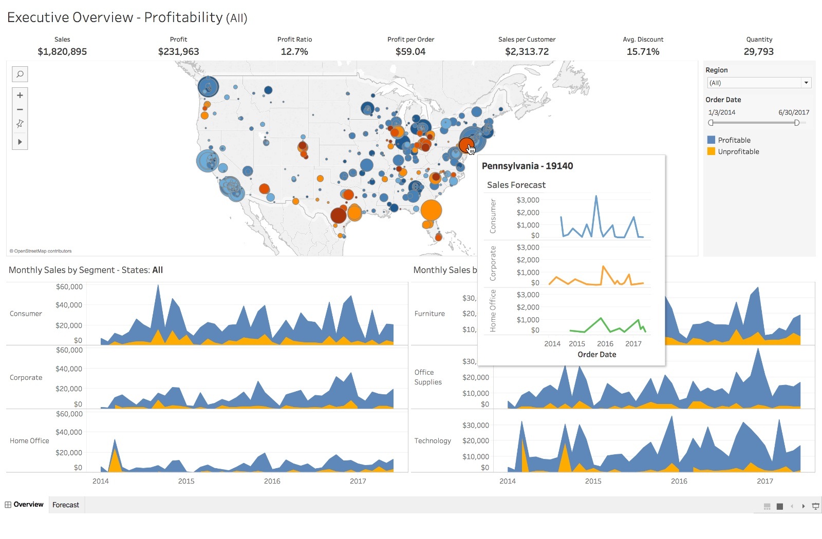
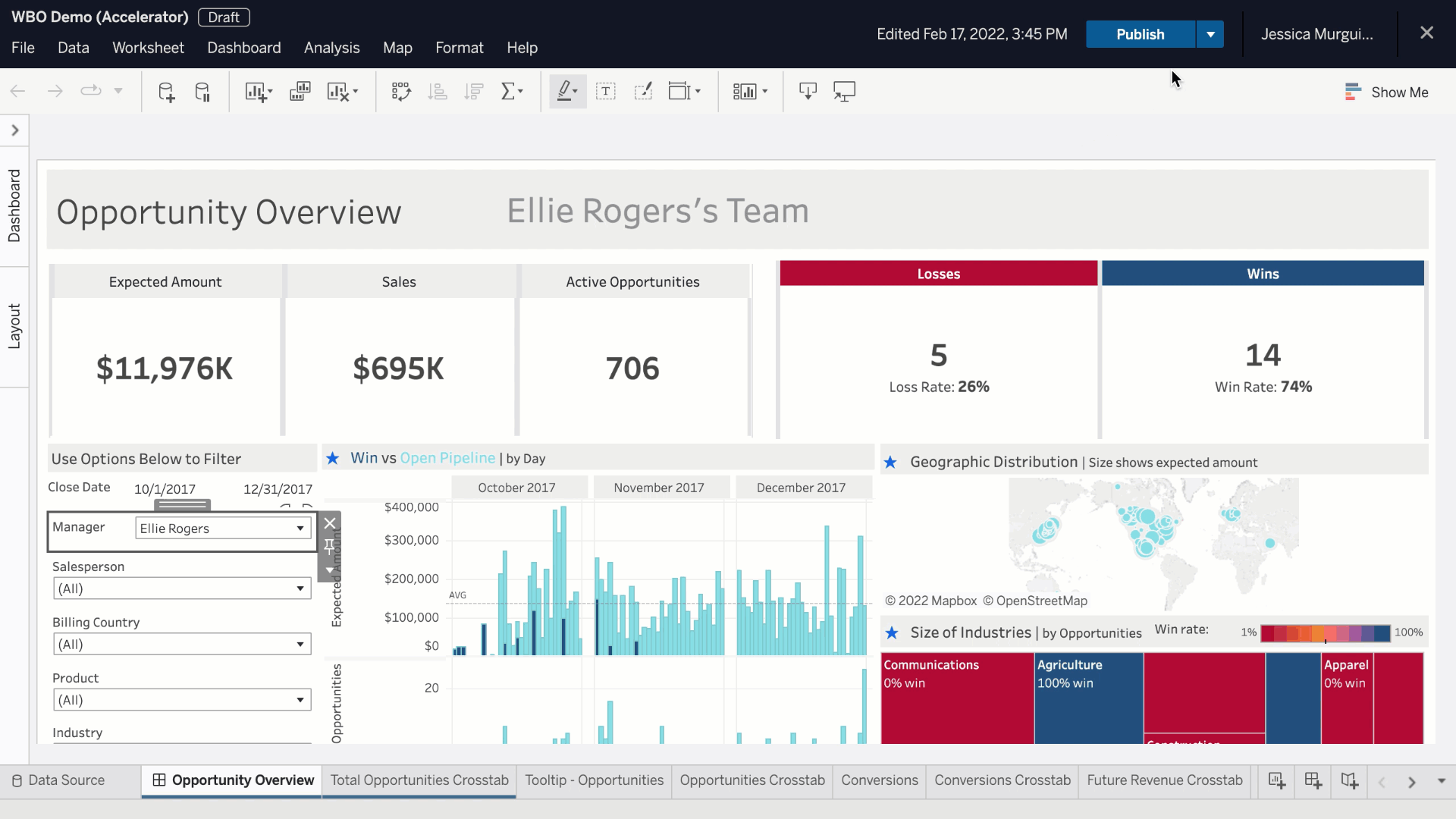
Creating Dashboards and Stories
Once your visualizations are ready, creating dashboards and stories enhances your data storytelling. Dashboards allow you to combine multiple visualizations into a single view, offering a comprehensive look at key metrics.
- Creating a Dashboard:
- Open a new dashboard tab.
- Drag and drop your desired visualizations onto the dashboard canvas.
- Add interactive elements like filters and action buttons.
Stories, on the other hand, help to guide viewers through a sequence of visualizations, providing context and narrative flow.
Collaboration and Sharing in Tableau
Finally, the collaboration and sharing capabilities of Tableau are indispensable for teams. Tableau Server and Tableau Online allow users to easily share dashboards and insights across organizations.
- Collaboration Features:
- User Roles: Control who can view or edit dashboards.
- Comments and Annotations: Enable team discussions and feedback directly on visualizations.
- Embedding Options: Integrate visuals into other platforms like websites and presentations.
By leveraging these advanced features, users can transform their analytical capabilities, ensuring that insights are easily shared and collaboratively refined. This holistic approach fosters richer conversations around data and helps organizations make informed, strategic decisions.

Integrating Tableau with Other Tools
Connecting Tableau with Excel
One of the most common integrations is connecting Tableau with Excel, a software many users are already familiar with. This connection allows for seamless data analysis, enabling users to visualize data stored in their Excel spreadsheets effortlessly.
- Steps to Connect:
- Launch Tableau and select “Connect to Data.”
- Choose “Microsoft Excel” from the data sources.
- Navigate to the desired Excel file and open it.
By merging Excel’s powerful calculations and Tableau’s impressive visualization capabilities, users can enhance their data insights significantly.
Using Tableau in conjunction with SQL databases
For businesses that rely on SQL databases, Tableau provides robust connectivity options. Connecting to databases like MySQL, PostgreSQL, or SQL Server allows for real-time data interactions and deeper analysis.
- Benefits of SQL Integration:
- Live Data Queries: Access-updated data without the need for manual imports.
- Nested SQL Queries: Perform complex data manipulations directly within Tableau.
This integration facilitates dynamic reporting that responds to the evolving business landscape.
Integrating Tableau with Big Data Platforms
In today’s data-driven world, integrating Tableau with big data platforms like Hadoop and Spark is increasingly important. Tableau’s ability to connect with these platforms enables users to visualize vast amounts of data efficiently.
- Integration Advantages:
- Real-time Visualizations: Analyze streaming data for immediate insights.
- Complex Data Scenarios: Leverage the power of big data analytics while enjoying Tableau’s visualization simplicity.
By incorporating Tableau with these advanced tools, organizations ensure they are well-equipped to derive insights from both small datasets and massive data lakes. This flexibility enables data professionals to tell nuanced stories from large sets of diverse data.
Best Practices for Effective Data Visualization
Choosing the Right Chart Types
Selecting the appropriate chart type is crucial for conveying your data clearly and effectively. The right visualization ensures that your audience can quickly grasp insights without confusion.
- Common Chart Types:
- Bar Charts: Ideal for comparing quantities across categories.
- Line Graphs: Best suited for illustrating trends over time.
- Pie Charts: Useful for showing proportions but should be used sparingly.
By understanding the strengths of different chart types, users can enhance the clarity of their data presentations.
Designing User-Friendly Dashboards
Creating dashboards that are user-friendly is essential for efficient data engagement. A well-designed dashboard allows users to absorb information at a glance.
- Design Tips:
- Clarity and Simplicity: Avoid cluttering with too many elements.
- Logical Layout: Organize information in a coherent flow.
- Interactive Features: Use filters and highlights to facilitate exploration.
For instance, when designing your dashboard, place the most important insights in prime locations and ensure navigation is intuitive.
Ensuring Data Accuracy and Integrity
Above all, ensuring data accuracy and integrity is paramount. Presenting incorrect data can mislead decision-makers and lead to poor outcomes.
- Best Practices for Accuracy:
- Data Validation: Regularly verify data sources for consistency.
- Version Control: Keep track of data changes and maintain a clear history.
- Collaborative Reviews: Have team members review dashboards before public release.
By implementing these best practices, organizations can cultivate trust and reliability in their data visualizations, empowering stakeholders to make informed decisions confidently. With attention to detail and a focus on user experience, data visualization can transform raw numbers into compelling insights.
Data Analysis and Insights with Tableau
Identifying Patterns and Trends
One of Tableau’s strong suits is its ability to identify patterns and trends within complex datasets. By utilizing visualizations like line graphs and heat maps, users can easily reveal underlying trends that inform business strategies.
- Tips for Identifying Trends:
- Utilize color gradients to highlight peak areas.
- Implement forecasting tools to predict future outcomes.
This process can allow organizations to respond to market demands and pivot strategies effectively.
Performing Statistical Analysis
Tableau also offers robust statistical analysis features that empower users to delve deeper into their data. Functions such as trend lines, clusters, and regression analysis provide further context to visualized data.
- Key Statistical Functions:
- Trend Lines: Illustrate overall data trends over time.
- Clustering: Group data into natural categories for better analysis.
- Reference Lines: Provide benchmarks for comparison and analysis.
Utilizing these tools cultivates a deeper understanding of the data landscape and can drive more informed decision-making.
Extracting Actionable Insights from Data
Ultimately, the goal of any data analysis effort is to extract actionable insights that can guide strategic initiatives. In Tableau, users can interact with their visualizations, applying filters and drilling down into specific metrics to uncover valuable information.
- Best Practices for Actionable Insights:
- Define clear objectives before analyzing the data.
- Share findings with stakeholders in an easily digestible format.
- Regularly revisit and refine insights as new data emerges.
By harnessing Tableau’s capabilities to identify patterns, conduct statistical analysis, and extract insights, organizations can become data-driven, making choices rooted in factual evidence rather than intuition. This not only fosters growth but also propels businesses forward in today’s competitive landscape.

Tableau for Business Intelligence and Decision Making
Role of Tableau in Business Intelligence
Tableau plays a pivotal role in the realm of Business Intelligence (BI) by transforming raw data into actionable insights. With its visual analytics capabilities, organizations can navigate complex datasets, making it simpler to uncover trends, monitor performance, and visualize key metrics.
- Key Functions in BI:
- Data Integration: Combine data from multiple sources for a holistic view.
- Interactive Dashboards: Create dynamic dashboards that update in real-time.
By centralizing and visualizing data, Tableau enhances clarity and efficiency in decision-making processes.
Leveraging Tableau for Strategic Decision Making
Effectively leveraging Tableau allows organizations to make data-driven strategic decisions. Users can harness visualization tools to simulate various scenarios, analyze outcomes, and understand impacts.
- Strategic Practices:
- Employ what-if analyses to forecast potential business changes.
- Use KPIs and performance tracking to align operations with strategic goals.
These approaches ensure that decisions are grounded in robust evidence and clear insights, reducing the risk of errors.
Case Studies and Success Stories
Numerous organizations have experienced tangible benefits from integrating Tableau into their BI processes. For instance, a leading retail company effectively utilized Tableau to analyze customer purchasing patterns, resulting in a 15% increase in sales after implementing targeted marketing strategies based on insights gleaned from data.
- Success Metrics:
- Increased Revenue: Companies have reported profits boosted by better inventory management.
- Operational Efficiency: Businesses frequently cite reduced reporting time from days to hours.
These case studies exemplify the potential of Tableau as not just a data visualization tool, but a cornerstone of effective business intelligence strategies, enabling organizations to thrive in today’s fast-paced environment.
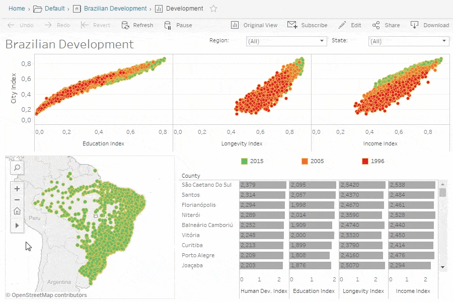
Tableau Community and Resources
Accessing Tableau Community Forums
The Tableau Community is a vibrant hub where users can connect, share knowledge, and seek solutions to common challenges. Accessing the community forums is simple and can provide invaluable insights from fellow Tableau enthusiasts.
- Key Benefits of Joining:
- Peer Support: Tap into the experience of a global network of users.
- Problem-Solving: Post questions about specific issues and receive prompt responses.
- Best Practices: Learn from shared projects and success stories.
Engaging with this community fosters learning and improves one’s Tableau skills through collaboration.
Utilizing Tableau Online Help and Documentation
For those diving into Tableau’s features, the Online Help and documentation are essential resources. They offer comprehensive guides on everything from installation to advanced analytics.
- Features of Online Documentation:
- In-Depth Articles: Detailed explanations of features and functionalities.
- Video Tutorials: Visual learning through hands-on demonstrations.
- FAQs: Quick answers to commonly asked questions.
These resources can significantly enhance the user experience and help you maximize Tableau’s capabilities.
Training and Certification Options
To further hone your skills, Tableau offers various training and certification options for users at all levels. Whether you are just starting or looking to prove your expertise, there’s something for everyone.
- Training Programs:
- Instructor-Led Courses: Hands-on learning with Tableau experts.
- Self-Paced Online Courses: Flexible options to learn at your own schedule.
- Certification Paths: Validate your skills through recognized certifications.
By investing in training and certification, users not only grow their personal skill sets but also become valuable assets to their organizations. Embracing these resources positions users to unlock the full potential of Tableau, ensuring that their data stories are impactful and insightful.
Future Trends and Developments in Tableau
Advances in Tableau’s Technology
As Tableau continues to evolve, significant advances in its technology enhance user experience and analytical capabilities. The advent of AI and machine learning integration is a game-changer, allowing for more intuitive data analysis.
- Key Technological Advances:
- Explain Data Feature: Automatically provides insights into data changes.
- AI-Driven Analytics: Predictive modeling capabilities empower users to make informed decisions based on trends.
These improvements help users focus on insights rather than grappling with complex datasets.
Predictions for the Future of Data Visualization
Looking forward, data visualization is expected to become more interactive and user-friendly. As businesses generate increasingly complex data, the demand for accessible visualization tools will rise.
- Emerging Trends:
- Augmented Analytics: Enhanced data storytelling through natural language processing.
- Real-Time Data Visualization: Immediate insights from live data feeds will become essential.
These evolving trends will shape how organizations visualize and analyze their data, emphasizing clarity and rapid understanding.
Innovations in Tableau’s Product Roadmap
Tableau remains committed to innovation, as indicated by its product roadmap. Upcoming features are set to include more extensive support for big data environments and additional customizable options for dashboards.
- Anticipated Innovations:
- Enhanced Mobile Experiences: Improved mobile capabilities for accessing insights on the go.
- Integration with Emerging Technologies: Seamless connectivity with IoT devices and blockchain for comprehensive data analysis.
By staying ahead of the curve, Tableau continues to solidify its position as a leading data visualization platform, preparing users to thrive in a data-rich future. Embracing these advances will empower organizations to tell compelling stories and derive actionable insights from their data.