Understanding Responsive Design
Definition and Basics of Responsive Design
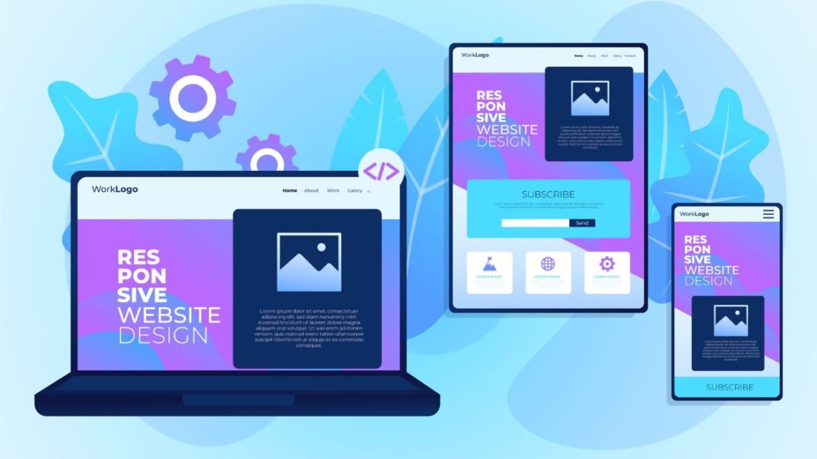
Responsive design is an essential approach in web development that ensures websites function and appear seamlessly across a variety of devices. By employing flexible layouts and fluid grids, responsive design automatically adapts to different screen sizes, orientations, and resolutions. This means that whether a user is browsing on a mobile phone, tablet, or desktop, they receive an optimized viewing experience.
Key elements of responsive design include:
- Fluid Grid Layouts: The layout adjusts according to the screen size using percentage-based widths.
- Media Queries: CSS techniques that apply different styles based on media features like screen width, device orientation, and resolution.
- Flexible Images: Images that scale within their containing element to avoid overflow and maintain clarity.
Significance of Responsive Design in Web Development
In today’s tech-savvy world, responsive design is not just a trend but a necessity. With over half of all internet traffic coming from mobile devices, websites that fail to provide a responsive experience risk losing significant engagement.
Consider this:
- Enhanced User Experience: A seamless design encourages visitors to stay longer and reduces bounce rates.
- Improved SEO Rankings: Search engines like Google prioritize mobile-friendly sites in their rankings.
Mastering responsive design ensures web developers can create inclusive, accessible websites—an outcome that benefits both users and businesses alike.

Introduction to React for Web Development
Overview of React Framework
Transitioning from understanding responsive design, it’s crucial to explore frameworks that amplify the effectiveness of our web apps. Enter React, a JavaScript library developed by Facebook that revolutionizes how developers build user interfaces.
React’s component-based architecture allows for the modular assembly of UI elements, meaning developers can create reusable code. This not only makes development faster but significantly simplifies maintenance as each component functions independently.
Key characteristics of React include:
- Virtual DOM: React minimizes the direct manipulation of the browser’s DOM, resulting in faster updates and a superior user experience.
- One-Way Data Binding: This aspect ensures that components communicate effectively without unnecessary data alterations, promoting predictability.
Benefits of Using React for Web Apps
The advantages of using React for web applications are considerable. Having implemented React in various projects, here’s what stands out:
- Performance Boost: With features like the Virtual DOM, web apps load quicker, leading to happier users.
- Rich Ecosystem: An extensive library of tools and components enhances development efficiency.
- Strong Community Support: A vibrant community implies plenty of resources, tutorials, and third-party libraries at developers’ fingertips.
Utilizing React fosters the creation of powerful, responsive web applications, making it an indispensable part of modern web development.

Building Responsive Web Apps with React
Designing for Multiple Devices and Screen Sizes
Continuing from our discussion on the advantages of React, let’s delve into the exciting world of responsive web app development. Designing for multiple devices and screen sizes involves understanding your audience and their device preferences. With the rise of smartphones and tablets, a static web layout no longer suffices.
Here are some key strategies to consider:
- Mobile-First Approach: Start your design process with mobile in mind. This ensures that your core features stand out on smaller screens.
- Breakpoints: Use CSS media queries to define breakpoints that determine how your layout adjusts at various screen sizes.
- Fluid Grids: Implement percentages for widths rather than fixed pixel values to create fluidity in your design.
Implementing Responsive Layouts with React Components
The beauty of React lies in its flexibility to implement responsive layouts effortlessly. Developers can utilize various libraries like React Bootstrap or Material-UI to support responsive design out of the box.
Key practices include:
- Component Flexibility: Structure components to adapt to changing screen sizes using CSS Flexbox or Grid layouts.
- Conditional Rendering: Leverage React’s state management to render different components based on the screen size to provide tailored experiences.
By integrating responsive design techniques with React’s powerful framework, developers can create dynamic web applications that delight users across all devices. It’s all about crafting experiences that engage, no matter the screen size!

Styling and Optimization Techniques
CSS Media Queries for Responsiveness
Continuing with the theme of building compelling web applications, it’s essential to focus on styling and optimization techniques that keep user experience at the forefront. CSS media queries play a pivotal role in achieving responsiveness. These queries allow developers to apply different styles based on the device characteristics such as width, height, and orientation.
For instance, a simple media query could look like this:
@media (max-width: 768px) {

    body {

        background-color: lightblue;

    }

}
Utilizing media queries helps in:
- Adapting Typography: Ensure text sizes are readable across all devices.
- Resizing Images: Render images appropriately, preventing overflow and preserving aspect ratios.
- Rearranging Layouts: Modify grid layouts for better visibility on smaller screens.
Performance Optimization for Responsive Web Apps
While styling for responsiveness is vital, performance cannot be overlooked. Slow-loading applications can frustrate users and drive them away, impacting retention. To enhance performance, consider these techniques:
- Minify CSS and JavaScript: Reducing file size leads to quicker load times.
- Lazy Loading: Load images and components only when they enter the viewport to save bandwidth and improve initial loading time.
- Optimizing Assets: Use image formats that are optimized for the web, such as WebP, for faster downloads.
By carefully implementing CSS media queries and performance optimization techniques, developers can ensure their responsive web applications are both visually appealing and efficient. Prioritizing these aspects helps create lasting impressions on users, enhancing the overall experience.

Testing and Debugging in Responsive Design
Responsive Design Testing Tools
Shifting our focus to testing and debugging in responsive design, it’s crucial to ensure that your web applications not only look great but also function seamlessly across various devices. Thankfully, various responsive design testing tools can aid developers in this process.
Some popular tools include:
- Browser Developer Tools: Most modern browsers, such as Chrome and Firefox, come equipped with built-in developer tools. These allow for easy simulation of different screen sizes.
- Responsive Design Checker: Simple online tools like Responsive Design Checker let you view how your site appears on various devices with just a URL.
- Google Mobile-Friendly Test: This helpful tool analyzes your website and provides insights on mobile usability, helping you meet SEO standards.
Debugging Techniques for Responsive Web Apps
Once the testing phase is complete, debugging is crucial to ensure a polished final product. Here are techniques to employ while debugging responsive web apps:
- Inspect and Modify: Use browser developer tools to inspect elements and modify CSS on-the-fly to see what works best.
- Console Log: Using
console.log()in your scripts can help track down issues in component rendering specific to screen sizes. - Cross-Browser Testing: Ensure your application performs consistently across browsers by utilizing tools like BrowserStack.
By leveraging effective testing and debugging techniques, developers can fine-tune their responsive web apps, ensuring a smooth and delightful user experience. It’s all about delivering a product that meets modern user expectations!

Advanced Topics in Responsive Design with React
Responsive Images and Media
As we explore advanced topics in responsive design with React, one area that often raises questions is how to handle responsive images and media. When developing applications, efficiently displaying images and videos across various devices is critical for both performance and user experience.
Here are a few strategies:
- Using the
<picture>Element: This HTML element allows developers to specify different images for various screen sizes and resolutions, ensuring that users always see the most appropriate image. - Responsive Image Techniques: Leverage techniques like
srcsetandsizesattributes to deliver images dynamically based on screen size and device pixel ratio. - CSS Object Fit: Use the
object-fitproperty to ensure images adapt to their containers while maintaining their aspect ratios.
These strategies not only enhance loading speeds but also provide a visually appealing experience regardless of device.
Accessibility Considerations for Responsive Web Design
Alongside media responsiveness, accessibility should never be sidelined. Ensuring that your responsive web app is accessible to all users is crucial. Here are some considerations:
- Semantic HTML: Using proper HTML tags aids screen readers, allowing visually impaired users to navigate your site effectively.
- Keyboard Navigation: Ensure all interactive elements are keyboard-accessible, improving usability for individuals with disabilities.
- Color Contrast: Maintain sufficient contrast between text and background colors to assist users with visual impairments.
By integrating responsive images and addressing accessibility, developers can create inclusive and engaging web applications. Mastering these advanced topics enhances not just the look but also the functionality of your projects, ultimately benefiting a broader audience.

Responsive Design Best Practices
User Experience Considerations
As we turn our attention to responsive design best practices, it’s essential to prioritize user experience (UX). A seamless UX can significantly enhance user satisfaction and retention. Here are a few considerations to keep in mind:
- Intuitive Navigation: Ensure that menus and navigation elements are easily accessible, regardless of device size. Sticky navigation bars can keep options at hand without cluttering the screen.
- Touch Targets: Make interaction points, such as buttons and links, large enough for touch. A general rule is to aim for a minimum size of 44×44 pixels.
- Consistent Branding: Maintain brand consistency in colors and fonts across all devices to create a unified experience.
A positive user experience will not only keep visitors on your page longer but also encourage them to explore further.
SEO Best Practices for Responsive Web Apps
In conjunction with UX, implementing SEO best practices for responsive web apps ensures that your site is visible to a wider audience. Here are effective strategies to consider:
- Single URL Structure: Use a single URL for all devices to avoid duplicate content issues, improving your site’s crawlability.
- Viewport Meta Tag: Implement the viewport meta tag to control layout on mobile browsers, enhancing how search engines read your site.
- Optimize Loading Times: Fast-loading pages are favored by search engines and improve user experience. Techniques like image optimization and lazy loading can contribute to this.
By focusing on user experience and adhering to SEO best practices, developers can create responsive web applications that not only engage users but also perform well in search rankings. It’s a win-win situation!

Conclusion and Next Steps
Summary of Responsive Design Principles with React
As we conclude our in-depth exploration of responsive design principles with React, it’s vital to summarize the key takeaways. We’ve discussed how responsive design is crucial for creating flexible and user-friendly web applications. By leveraging React’s component-based architecture, developers can build applications that adapt effortlessly across devices.
Key principles include:
- Fluid Layouts: Design components to adjust seamlessly to various screen sizes.
- Media Queries: Utilize CSS media queries to optimize styles for different devices.
- Accessibility: Ensure your applications are navigable and usable for everyone, regardless of their abilities.
Employing these principles enhances both user satisfaction and application performance.
Further Learning Resources for Mastering Responsive Design
For those eager to delve deeper into mastering responsive design, several resources can help advance your skills:
- Books: Consider “Responsive Web Design with HTML5 and CSS” by Ben Frain for comprehensive insights.
- Online Courses: Platforms like Udemy and Coursera offer tailored courses on responsive design and React.
- Communities: Engage with communities like Stack Overflow or Reddit’s web development forums to ask questions and share experiences.
By harnessing these resources, developers can fortify their knowledge and skills in responsive design, making them formidable players in the dynamic field of web development. Happy coding!

